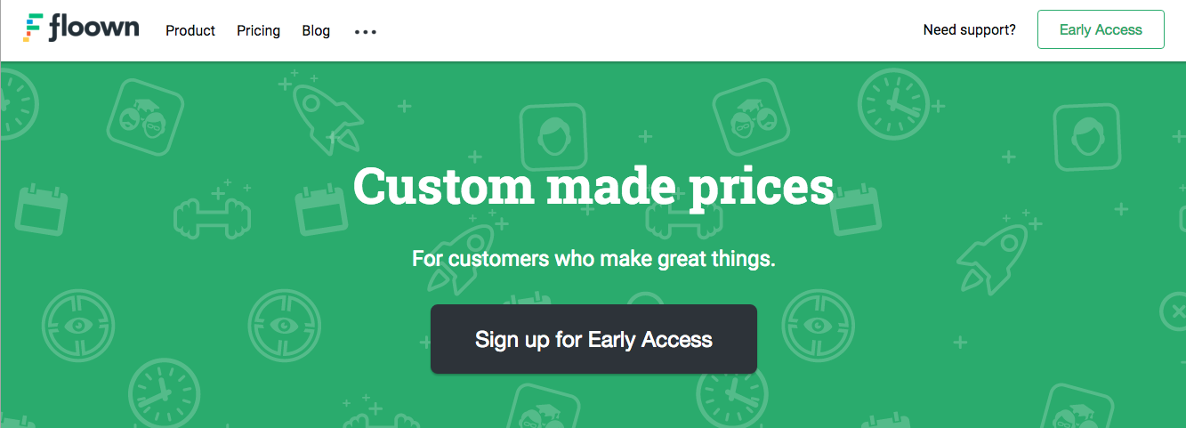
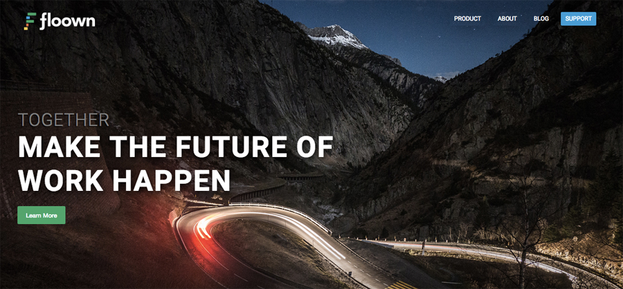
A lot can change in a few weeks — especially in startup land. Where a month ago I proudly wrote about launching the renewed floown.com website, I now write proudly that that very renewed website has been canned, and a new renewed floown.com website has been launched.

Sounds insane? Well, it was and it wasn’t.
Back in December we had been making good progress on our platform, the actual application that hopefully will make a change in the Future of Work. That progress was in no way reflected on our website though. In fact our website didn’t feature anything about what our product actually entails. And shit, we could hardly change a few sentences or add pages without going through a bunch of hoops. Like I wrote back then in my blog post.
Our renewed website in January was thus a great improvement in that sense. By changing the technical foundation from going to a (badly) customized Concrete5 to a lightweight Jekyll we greatly increased the site speed, control over changes and content. We however forgot to start out with a good design. That’s bad.
What I found out the hard way a month ago: making the design up as you go doesn’t work. Back then my judgement about our site’s look and feel was clouded. I wasn’t as critical as I should have been, because it took so much energy just creating it. Because my workflow was flawed and that did finally start to show. Soon after we launched it, we were getting doubts about what we created.

During those days we were talking a lot about change anyway. We were busy replacing some of the terminology we used when talking about our platform, we were in the middle of finishing up our branding efforts, as well as tying up a lot of loose ends in regards to the functionality of our platform.
Finally one of our co-founders (who is in fact a designer) said the words we all secretly thought: this website design isn’t gonna cut it. It doesn’t fit our application, our brand and it sends out a confusing message. We need to address this.
We quickly assessed our options. The technical foundation was good, we agreed. What had to change was the design and content. And more importantly, there had to be a good workflow.
This time however we made a critical change in dividing the workload. Where on the first website attempt I took on the bulk of the work myself, now we shared the work between three people. One designer, one writer, one constructor. That made sense.
Rebuilding floown.com over the last two weeks has been a very fruitful and educational endeavor. I learned much about doing things in the right order, using the right processes, making use of each others strengths. We’re all very proud of the new website and confident that it will help reach our goals.
For more on the processes that we used: